From Fragmented Insights to Clear Direction
CapMetro Digital Experience Redesign
This project explores how research can be used to create clarity and not simply gather insights.
We focused on understanding how users navigate CapMetro’s digital ecosystem in time-sensitive situations.
The goal was to identify usability issues and opportunities for improvement.
As research progressed, the challenge became not just identifying issues, but making sense of them.
Overview
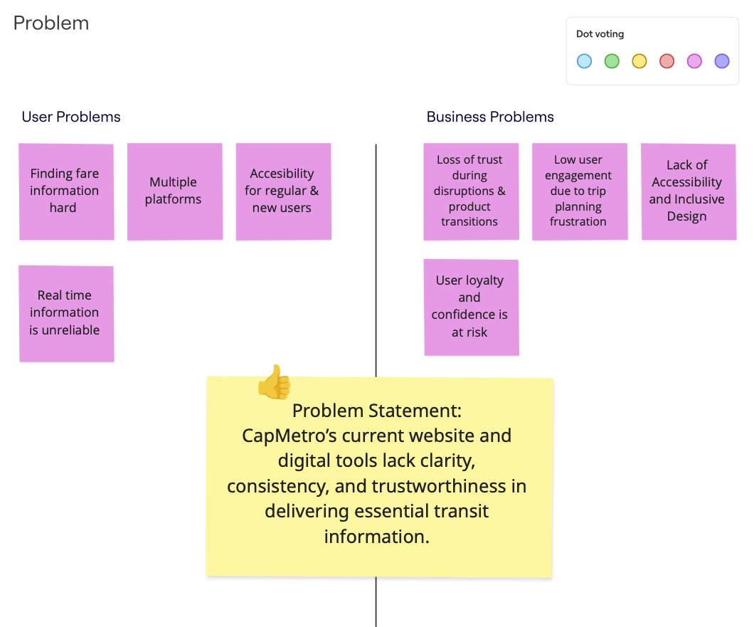
Problem
Solution
Outcome
Fragmented tools made information confusing
Synthesized user research to clarify needs and align direction
Defined clear priorities that improved usability and clarity
Context
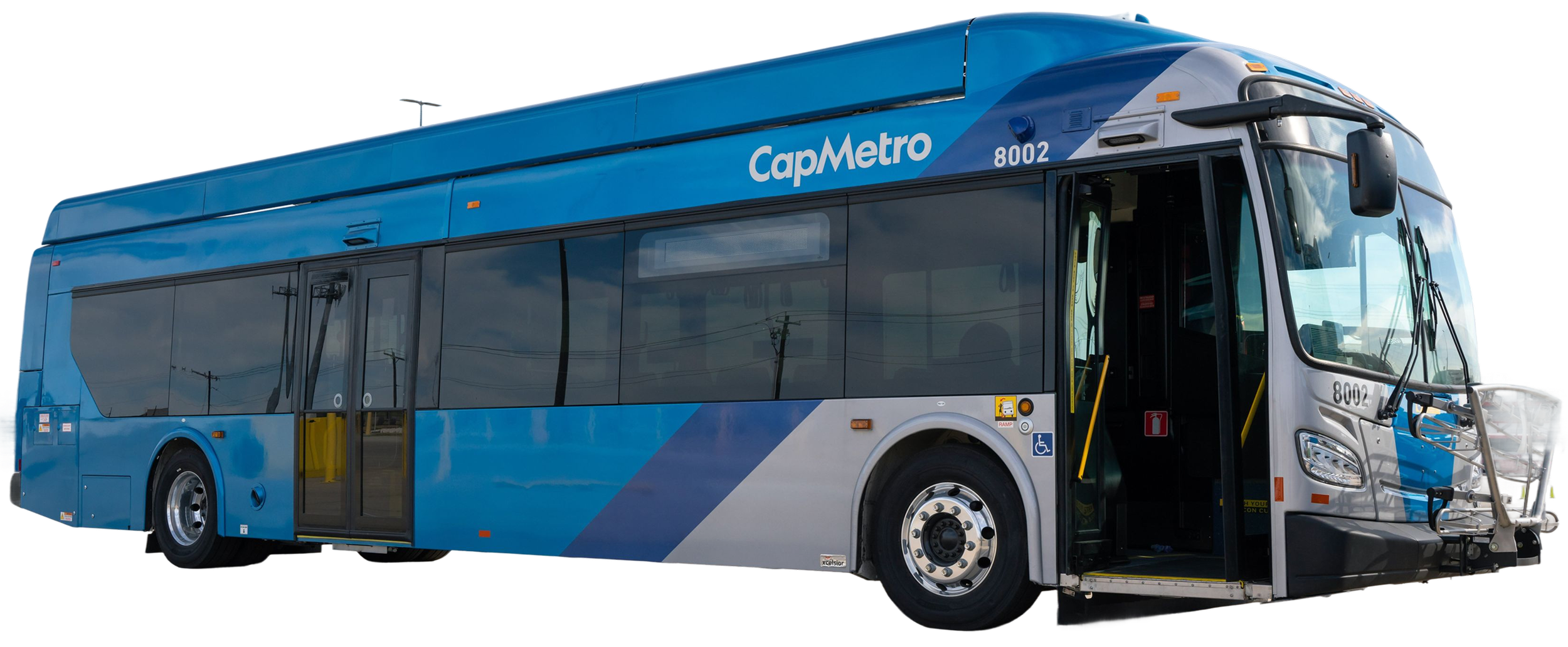
CapMetro serves over1.3 million people in the Austin area, with thousands of daily riders relying on its services for commuting, errands, and events.
However, its digital ecosystem is fragmented across multiple platforms:
Website (information-heavy)
Transit app (trip planning)
Umo app (payments)
This creates a complex experience where users must switch between tools to complete a single task.
The Challenge
While the main focus was usability, the real challenge ended up being clarity.
While conducting research, insights accumulated quickly across interviews and observations. However, they did not align on common goals.
Different team members focused on different issues such as accessibility, trip planning, or fare payments.
While all were valid, there was no shared understanding of what mattered most.
The core challenge became: How do we turn scattered research into a clear direction?
Caption: Team Miro board brainstorming with multiple competing priorities. No clear alignment across issues.
My Role
I contributed to
research planning
interview design & interviewing
data analysis & synthesis
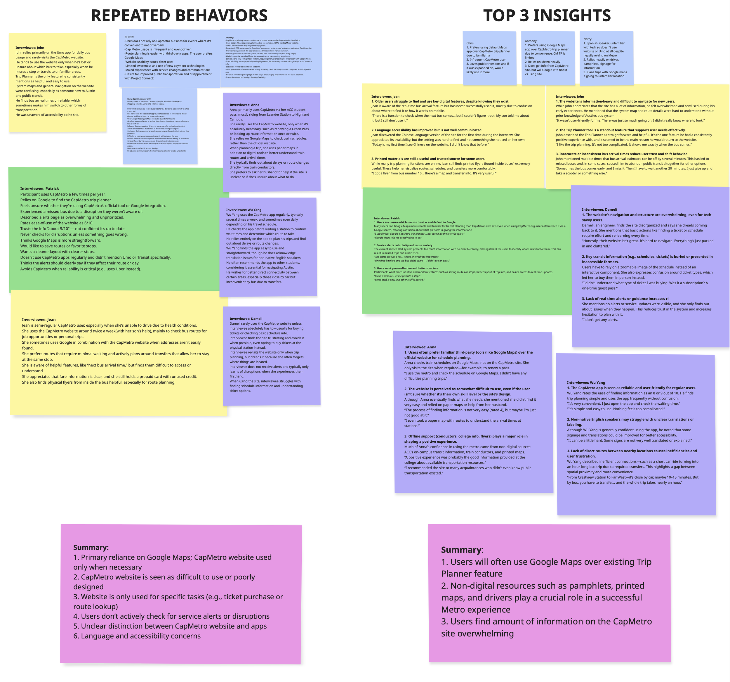
As interviews progressed, insights accumulated.
I focused on making sense of complexity in fragmented data by working to:
Identify patterns across participants
Connect behaviors to underlying problems
Translate raw findings into structured insights
I consistently asked:
What patterns are we actually seeing?
What is causing this confusion?
How do we turn this into direction?
This role became crucial during synthesis, where clarity was needed to move the project forward.
Caption: User behaviors and insights organized and summarized into groups on a Miro board frame.
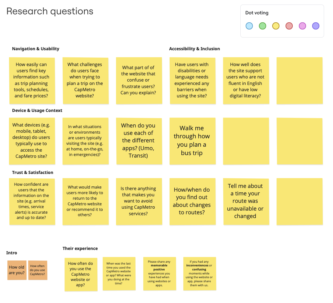
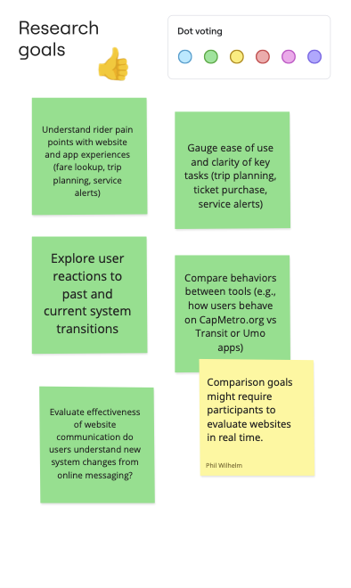
Research Approach
To reduce ambiguity, I helped structure our research around behavior and perception.
As a team, we focused on:
Trip planning and navigation behaviors
Transitions between platforms and their ease of use
Trust and accuracy in real-time information
Accessibility across diverse users
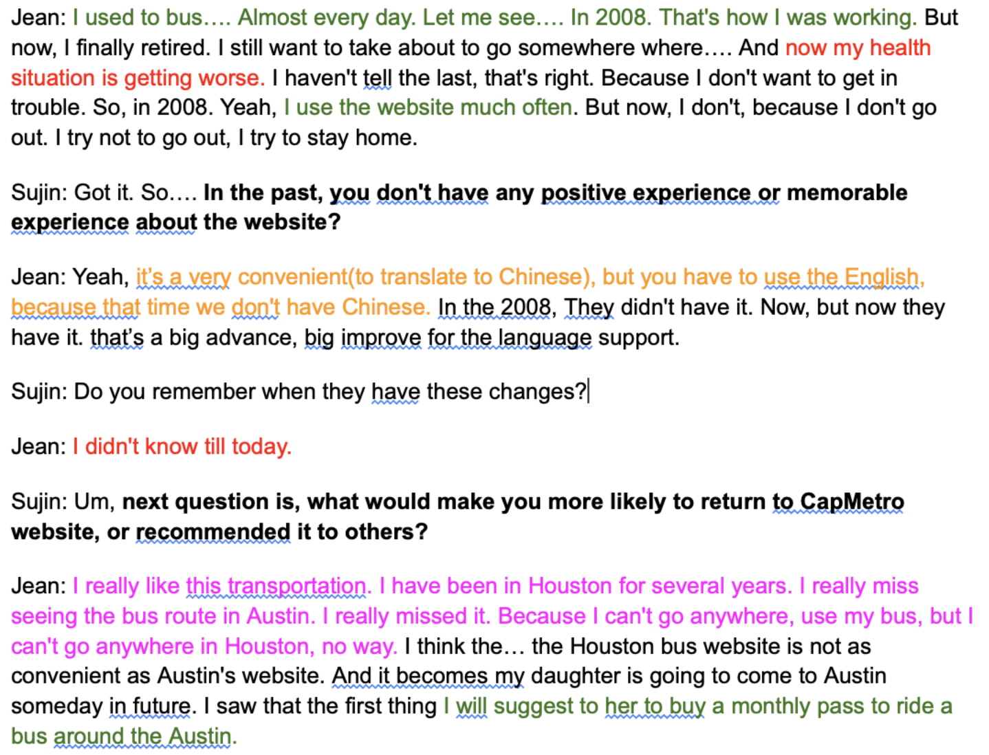
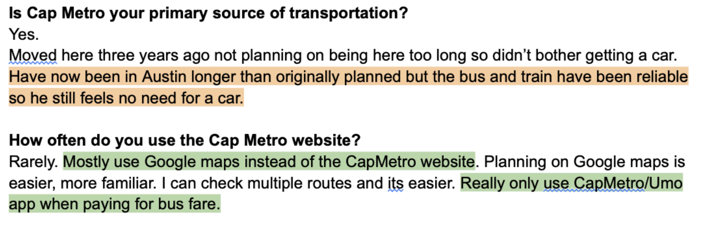
We conducted semi-structured interviews with 9 participants, including both frequent and occasional riders with varying levels of familiarity and technical comfort.
This approach allowed us to capture both what users do and how they experience the CapMetro experience..
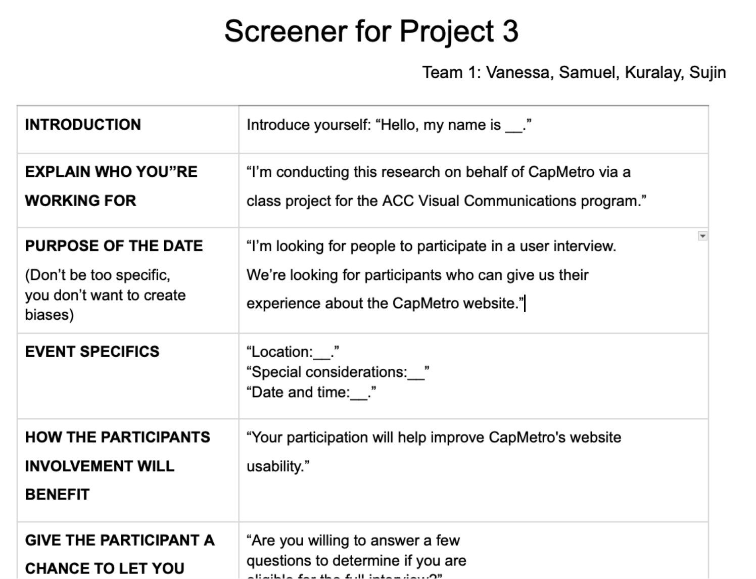
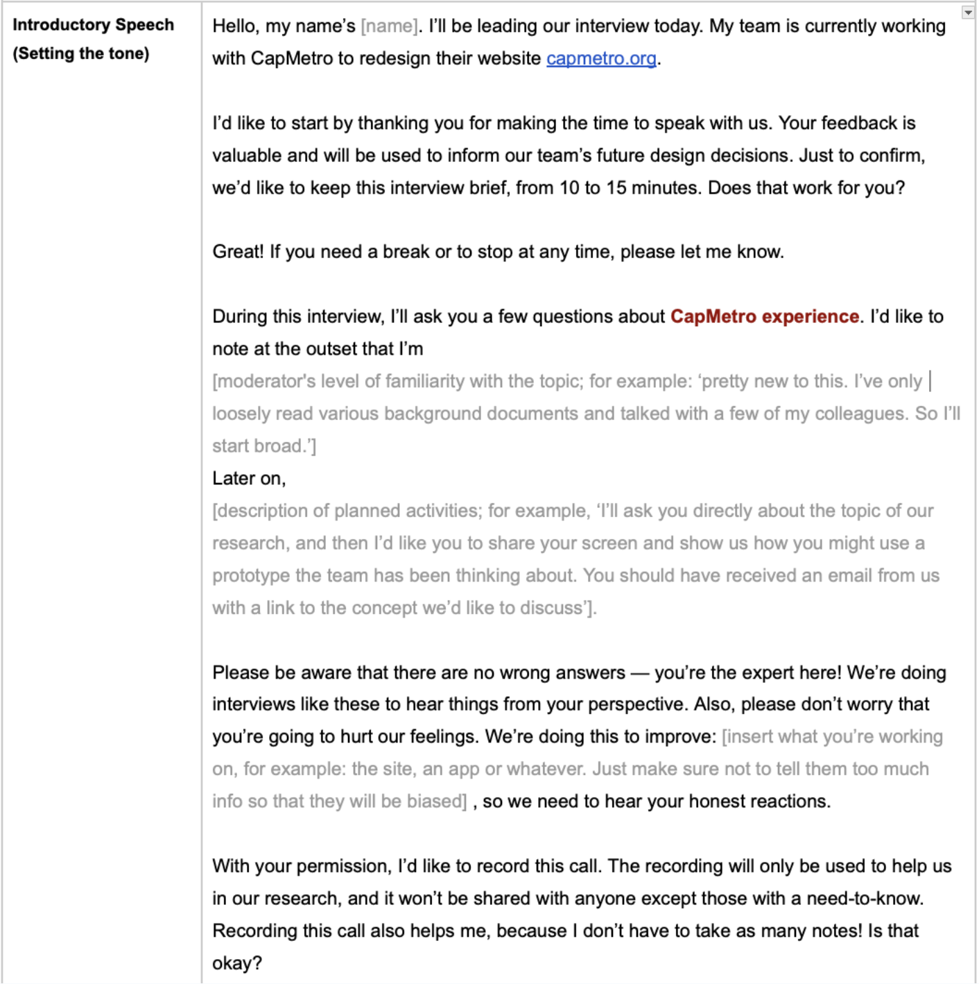
Caption: small previews of the interview screener, the interview protocol/script, and interview transcripts.
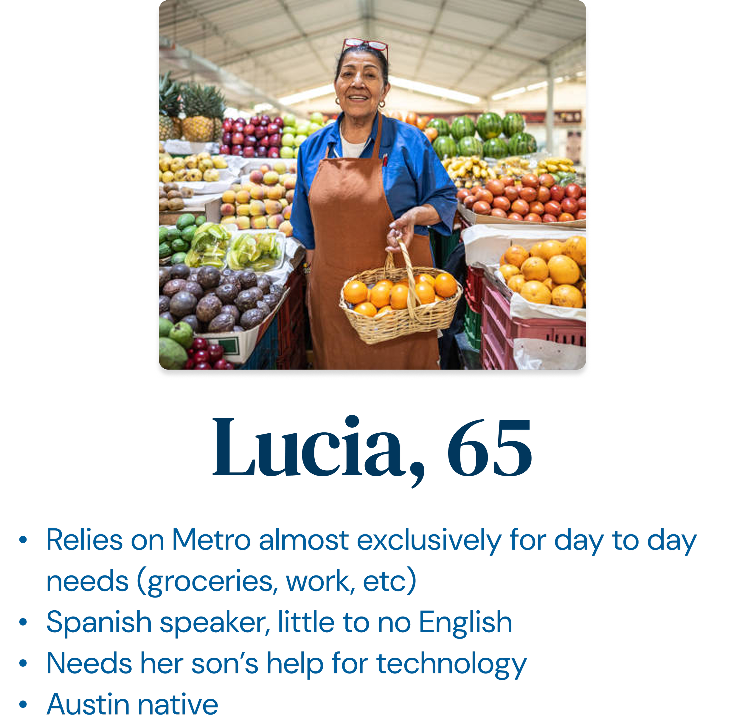
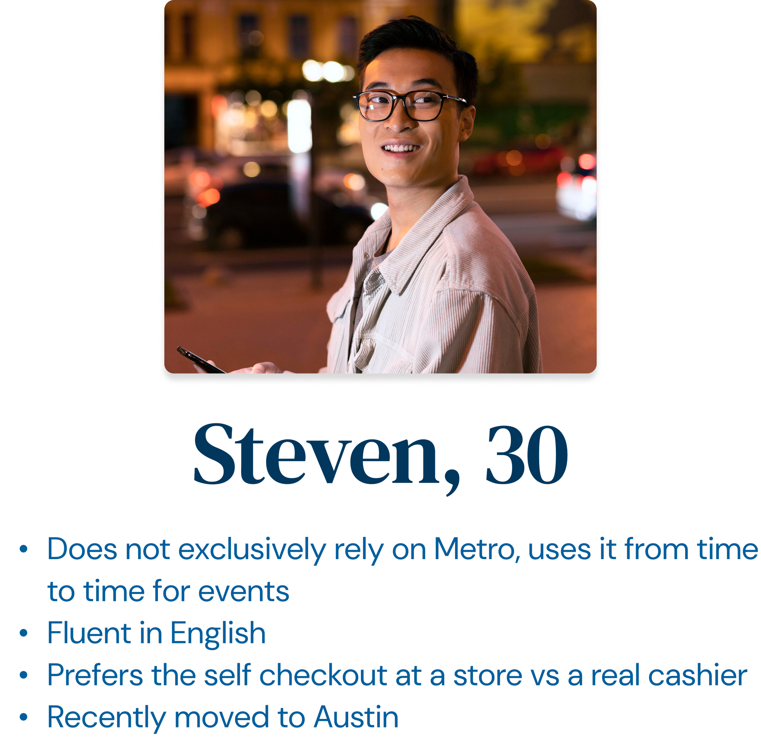
Understanding the User
CapMetro users represent a wide range of needs and contexts:
Students and commuters
Elderly or less tech-savvy users
Multilingual riders
Occasional riders and visitors
A key pattern emerged:
Many users interact with the system in moments of urgency — not casually, but when they are lost, confused, or under time pressure.
This reframed the problem:
The experience must prioritize clarity, speed, and immediate guidance.
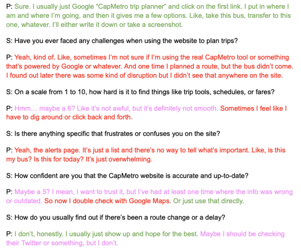
Key Insights
1. Users rely on the system when they are lost
Many participants only used the website in stressful situations, such as missing a stop or not knowing which route to take. This makes simplicity and speed essential.
2. The ecosystem is too fragmented
Users must switch between multiple tools to complete a single task, creating confusion and cognitive overload.
3. Information overload reduces usability
Users reported:
Too many options
Difficulty understanding maps
Lack of clear hierarchy
Which makes it difficult for users to navigate effectively.
4. Trust in real-time data is inconsistent.
Uncertainty around arrival times impacts decision-making and increases frustration.
5. Accessibility is present but not discoverable
Features such as language options are present, but not easily accessible nor discoverable.
“I use the website when I’m lost.... I don’t know what bus to take.”
“There was a lot of information… I still don’t know how to use the website.”
“I didn’t know there was a Spanish option… it’s at the bottom.”
Turning Point:
Structuring the Data
As we moved on, I focused on organizing the research into meaningful patterns.
Rather than treating each observation individually, I grouped findings based on:
User goals and needs
Behaviors and tasks
Barriers and frustrations
Beliefs and perceptions
This shifted the team’s perspective from:
“What did users say?” to “What patterns are emerging across users?”
This shift created alignment and made it possible to define clear direction.
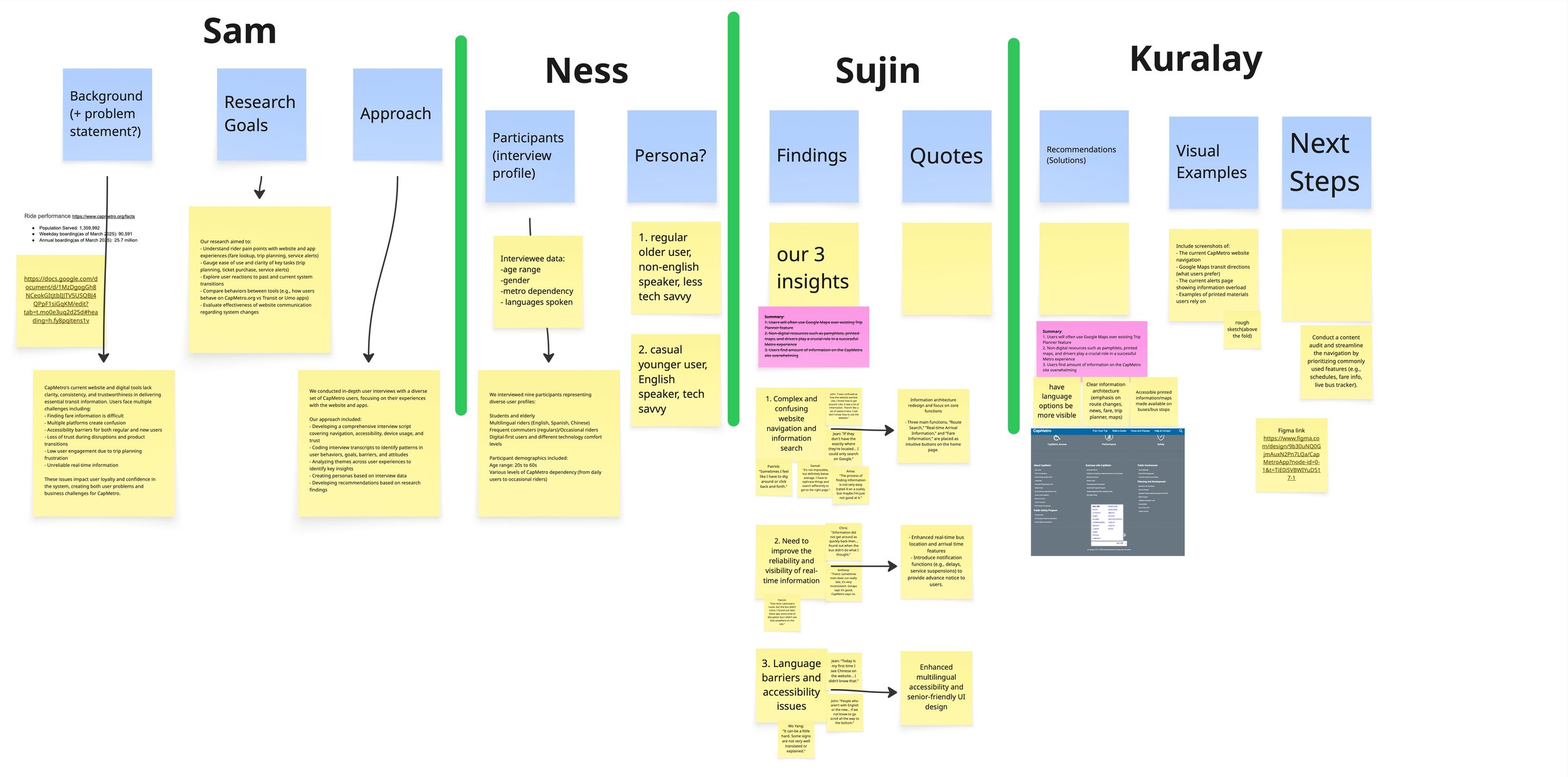
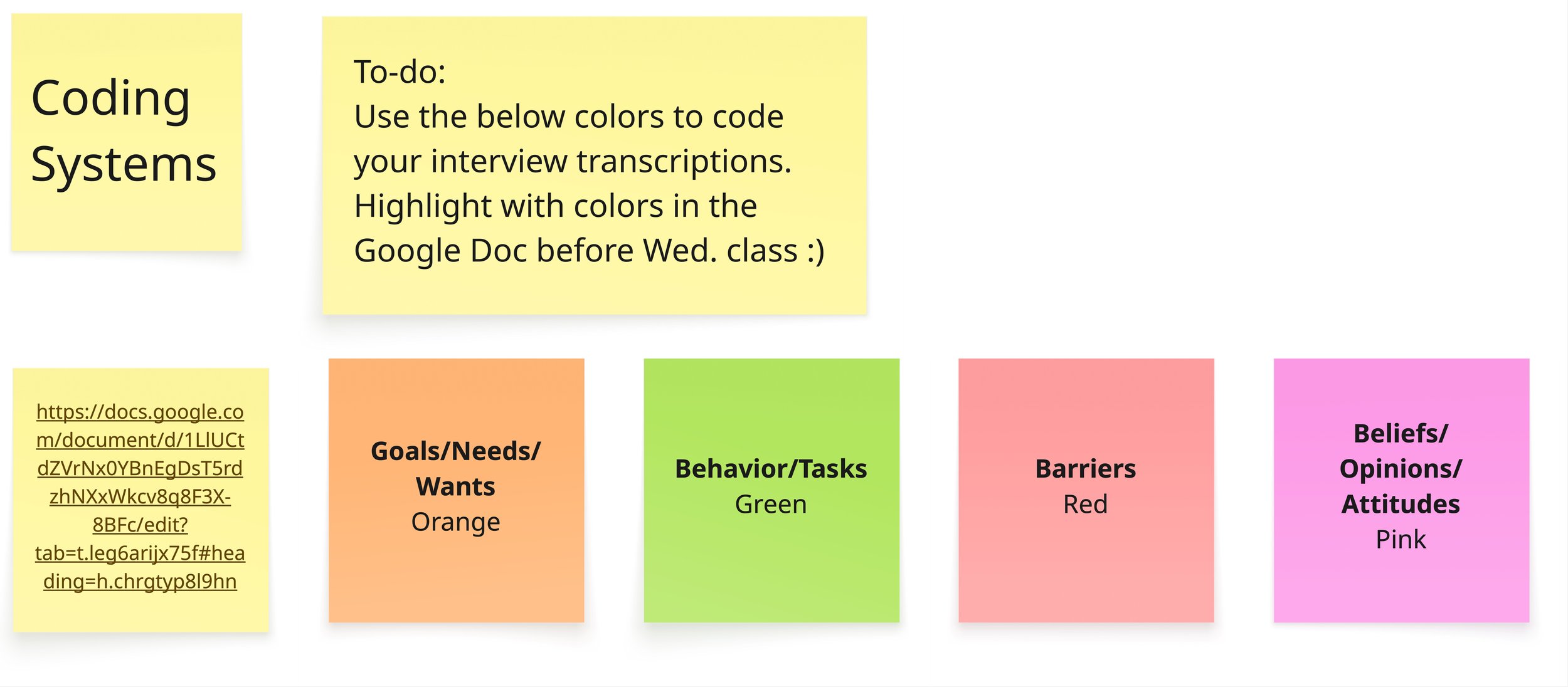
Synthesis
I led the effort to structure our findings through thematic and color coding:
Goals / Needs
Behaviors
Barriers
Beliefs
By organizing the data this way, I was able to:
Identify recurring patterns across participants
Connect surface-level behaviors to deeper frustrations
Transform raw data into structured understanding
Design Opportunities
From this structured understanding, we identified key opportunity areas:
Reduce platform fragmentation
Improve information hierarchy
Design for urgency and time-sensitive use
Increase trust and transparency
Enhance accessibility visibility
Outcome
Our research provided a strong foundation for redesigning the CapMetro experience and evolving the project. By bringing structure to the research I helped shift our team’s focus from:
Features → Systems
Information → Action
Content → Clarity
This resulted in:
Stronger alignment across the team
Faster, more confident decision-making
Clear, research-backed priorities for design
The project moved from collecting insights to acting on them.
Reflection
This project reinforced a key principle:
Clarity comes from structure.
I learned that:
Users interact with systems under real constraints, not ideal conditions
Clarity is more important than completeness
Designing for urgency requires prioritization, not more features
Most importantly, I strengthened my ability to:
Extract meaning from complex qualitative data
Identify patterns across diverse users
Translate research into actionable direction
This project showed me that research is not simply gathering information, it is also structuring it in a way that enables better decisions and grounds them in real user needs.
One of my strengths as a designer is clarifying complexity in projects and in how teams understand them.