
From Ambiguity to Structured Experience
Ledger: Financial App Tailored for Students
This project explores how an open-ended fintech concept evolved into a structured and intuitive product.
Faced with a broad set of ideas and no predefined direction, I focused on organizing complexity through feature architecture and interaction structure.
Overview
Problem
Solution
Outcome
Too many ideas but no overall structure
Created a system through sitemap and hierarchy
Clear navigation, reduced cognitive load
Context
This project began as an open-ended fintech opportunity.
Our team was tasked with designing a financial app for young users without a predefined feature set, requirements, or clear direction.
We were responsible for defining the value of the product ourselves, including: identifying core problems, selecting features, and determining how everything would connect into a usable experience.

The Challenge
The main challenge was structure, not visual design.
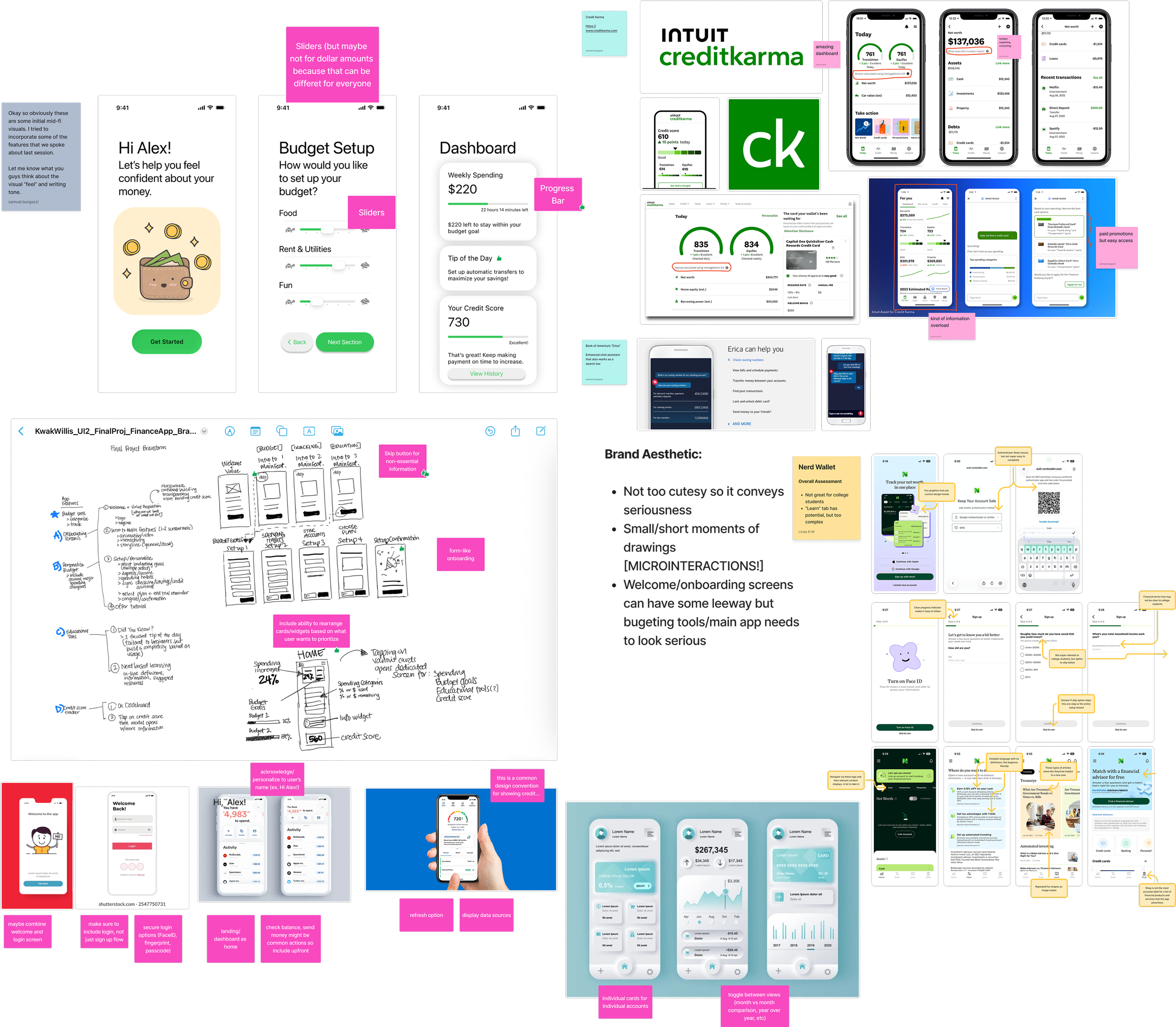
We had many promising ideas, including budgeting tools, credit score monitoring, rewards systems, linked accounts, notifications, and even an AI assistant.
However, there was no clear hierarchy or organization.
This made it difficult to answer key questions:
What features are primary vs secondary?
How do these features connect?
What does the user journey look like step-by-step?
Without structure, decision-making became unclear and inconsistent.
My Role
I contributed to:
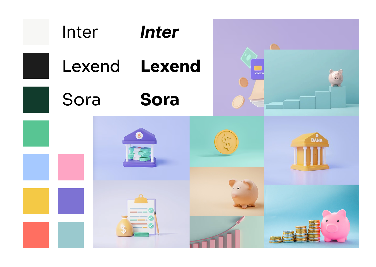
brand visual design
product ideation
interaction structure
supporting design system components.
More importantly, I consistently focused on organizing the product, asking:
How are we structuring this?
Where does this feature belong?
I helped guide the team toward thinking in terms of systems rather than isolated features
The Problem
Ideation Chaos
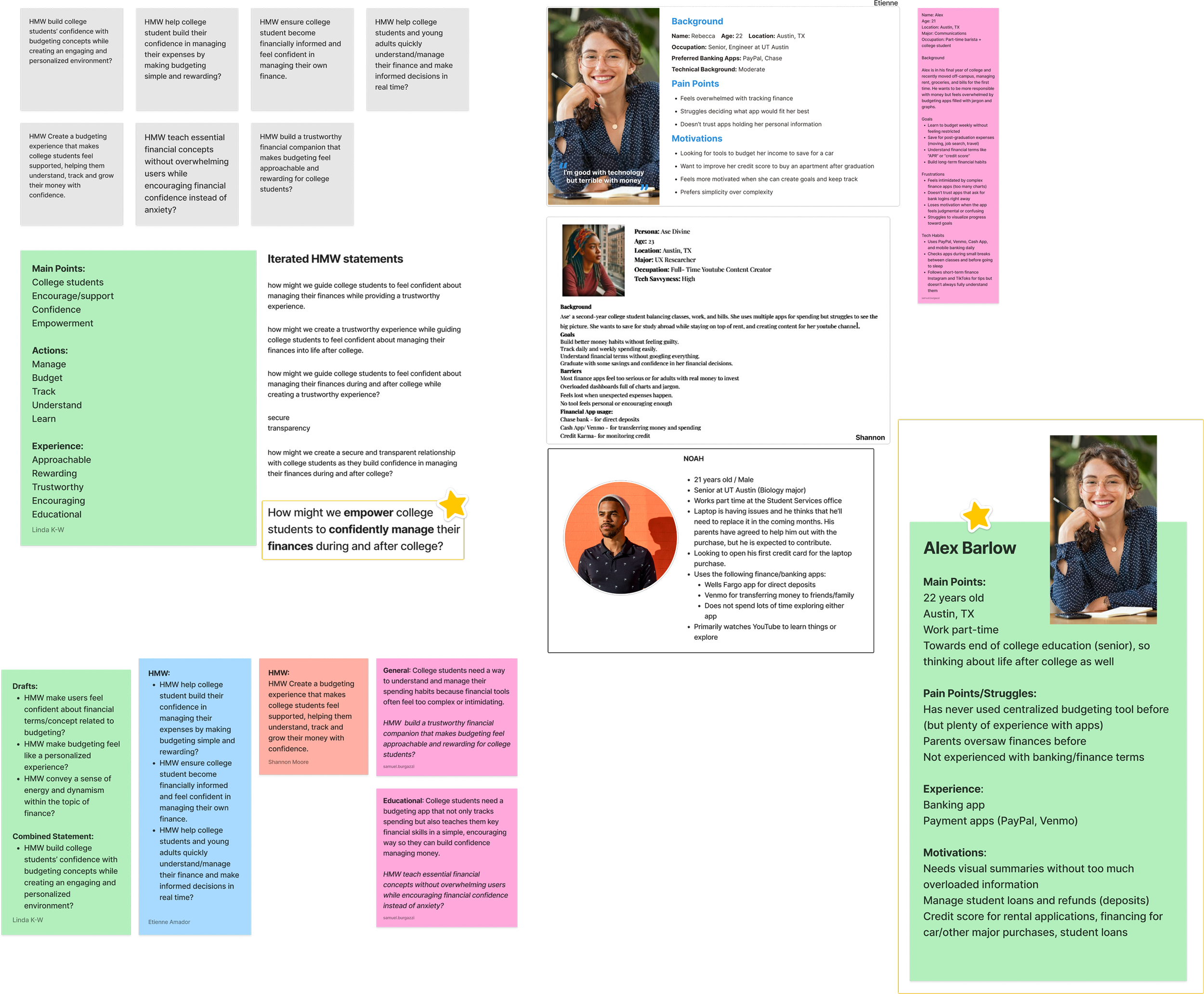
In the early stages, we explored a wide range of ideas through “How Might We” statements, personas, feature brainstorming, and competitor analysis.
While this created strong exploration, it also led to fragmentation.
Different team members imagined the product in completely different ways. Some prioritized budgeting, others focused on credit scores, and others on rewards.
Without a shared structure, there was no alignment.
The core problem became:
How do we turn multiple ideas into a cohesive, usable product?
Turning Point
Site Map
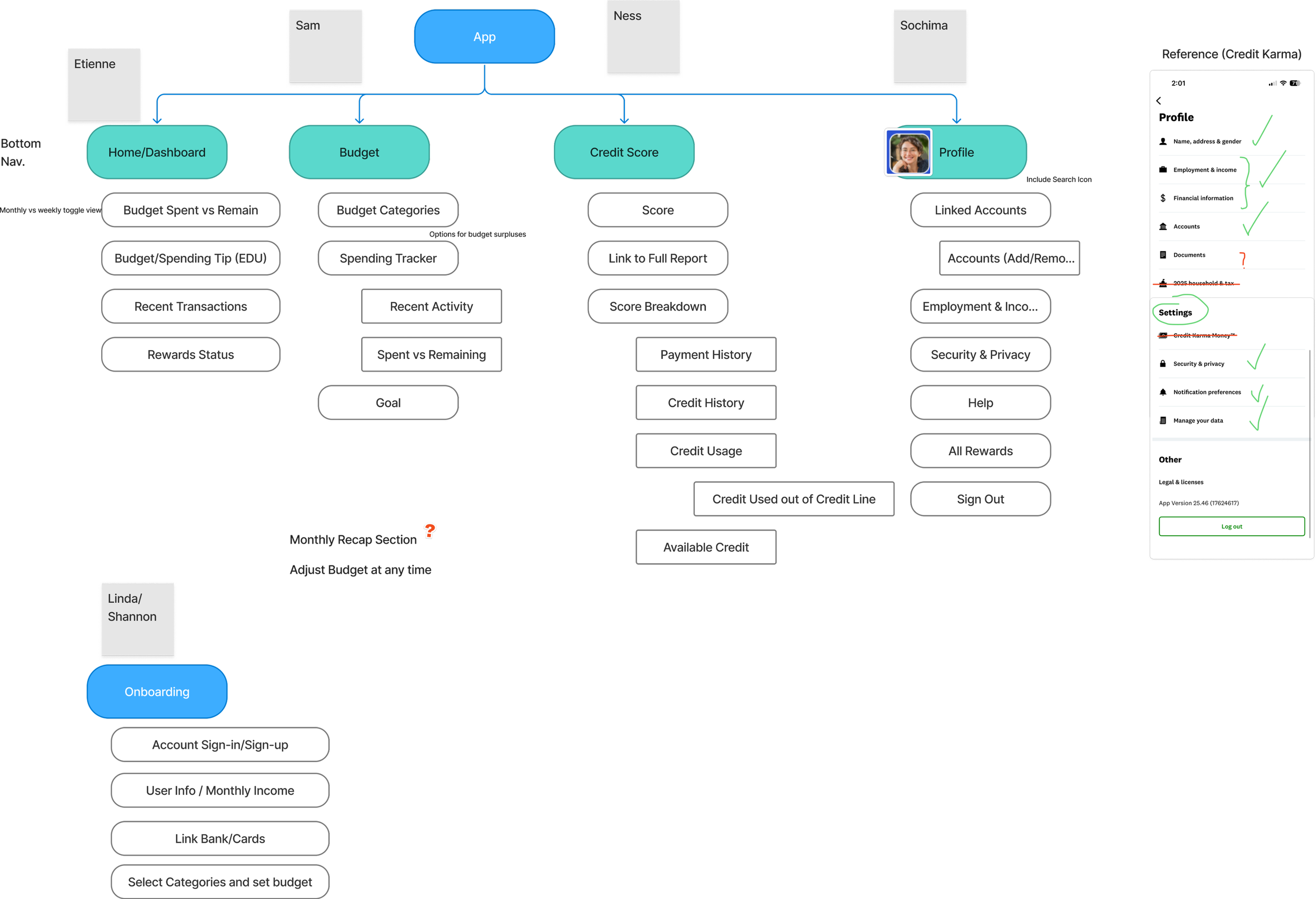
I proposed creating a sitemap to organize the product.
We defined:
Primary navigation (Home, Budget, Credit Score, Profile)
Feature groupings within each section
Hierarchy and relationships between features
This forced us to answer critical questions:
Is this essential or optional?
Where does this feature live?
Does this belong in this section or somewhere else?
The conversation shifted from:
“What features should we include?” to “Where does this belong in the system?”
This shift grounded our decisions and gave the team a shared structure moving forward.
Structure to System
Once the structure was defined, the product became coherent.
Interaction flows became clearer because they followed a defined hierarchy.
Navigation became more predictable, and components became more consistent.
We developed:
Clear bottom navigation
Logical feature grouping
Consistent transitions between sections
The experience began to feel intentional rather than layered.
Outcome
Clarifying structure improved the user experience in three key ways:
Intuitive navigation — users can predict where features are located
Reduced cognitive load — unnecessary feature stacking was eliminated
Clear relationships — features no longer competed, but worked together
The experience became more organized, usable, and cohesive.
Reflection
This project reinforced a key principle: turning ideas into structure enables better decisions.
Structure enables clarity
Clarity enables alignment
Alignment improves user experience
I realized that one of my strengths as a designer is organizing complex systems. This project allowed me to apply that skill in a collaborative environment and showed how structuring ambiguity leads to stronger design outcomes.
Project Presentation
Presentation Format
This is the same case study found above in a more traditional and effective format.