From Complex Data to Visual Communication

Animation and Visualization System for Educational Data
Individual fellowship project · Spring 2026
Role: Data Animation & Visual Design Fellow
Collaboration: E3 Alliance Communications and RADS teams
I redesigned four educational data visualizations, created animated versions, and developed a supporting style guide. I focused on titles, direct labels, color hierarchy, and motion to make the research’s key comparisons easier to follow within E3 Alliance’s existing brand.
Overview
Problem
Solution
Outcome
Important data is hidden behind lack of visual clarity
Created animations and a visual communication design system
Four redesigned graphs, animated exports, and a supporting style guide
Three Design Decisions
1. Lead with the finding
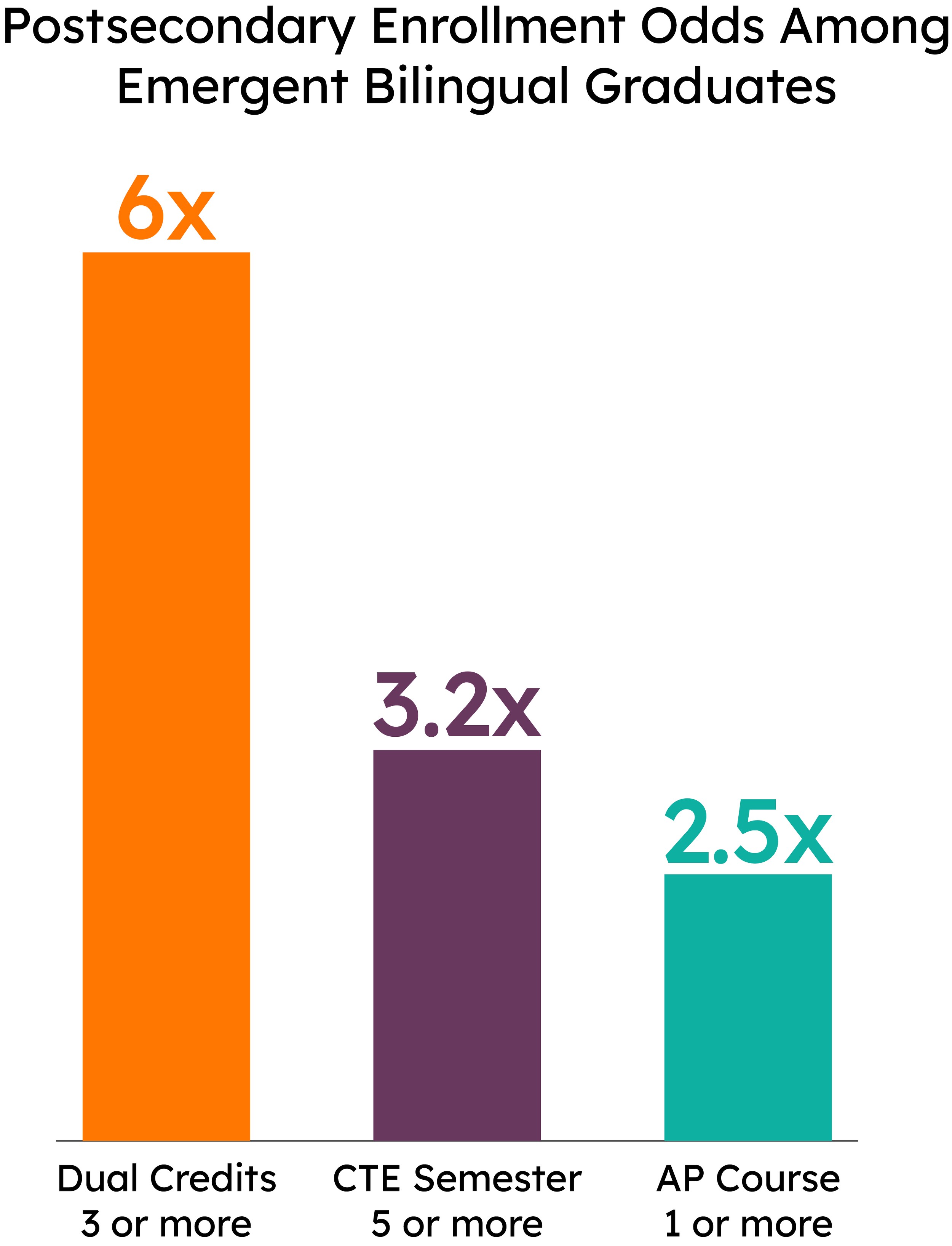
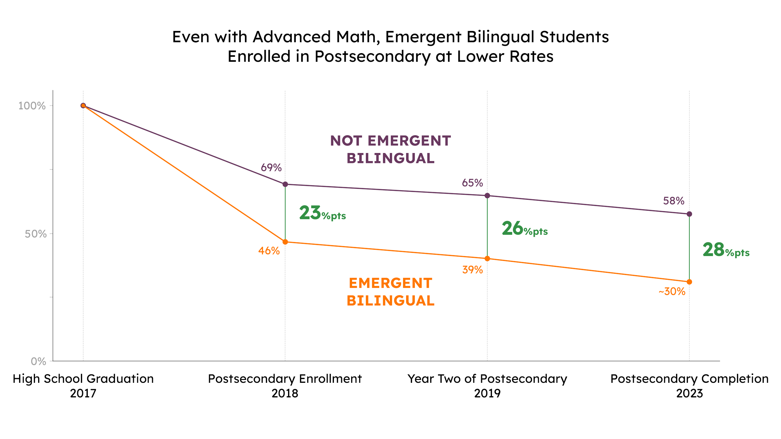
A finding-led title makes the enrollment difference the entry point.
2. Label the comparison
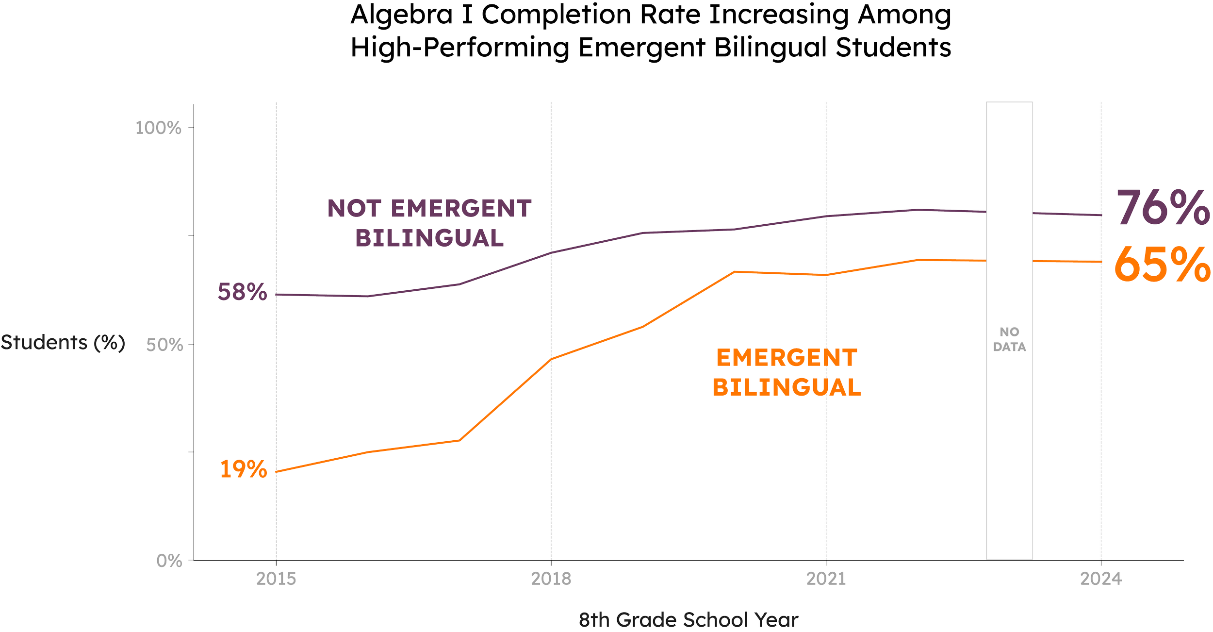
Direct group labels sit beside the lines, so readers can follow the data without returning to a legend.
3. Make the gaps visible
23, 26, and 28 percentage points are called out at the later milestones.
E3 supplied the research. I shaped the hierarchy and presentation.
Context
During E3 Alliance’s Spring 2026 fellowship, I redesigned educational research graphs supplied by the Emerging Bilingual Steering Committee. The goal was to make the findings easier to follow and adapt across communication platforms.
The UX question
How do people read the finding? My role went beyond changing how the graphs looked: I organized how readers encounter the information.
Preserve: the underlying research and E3’s brand.
Clarify: titles, labels, color, and the reading sequence.
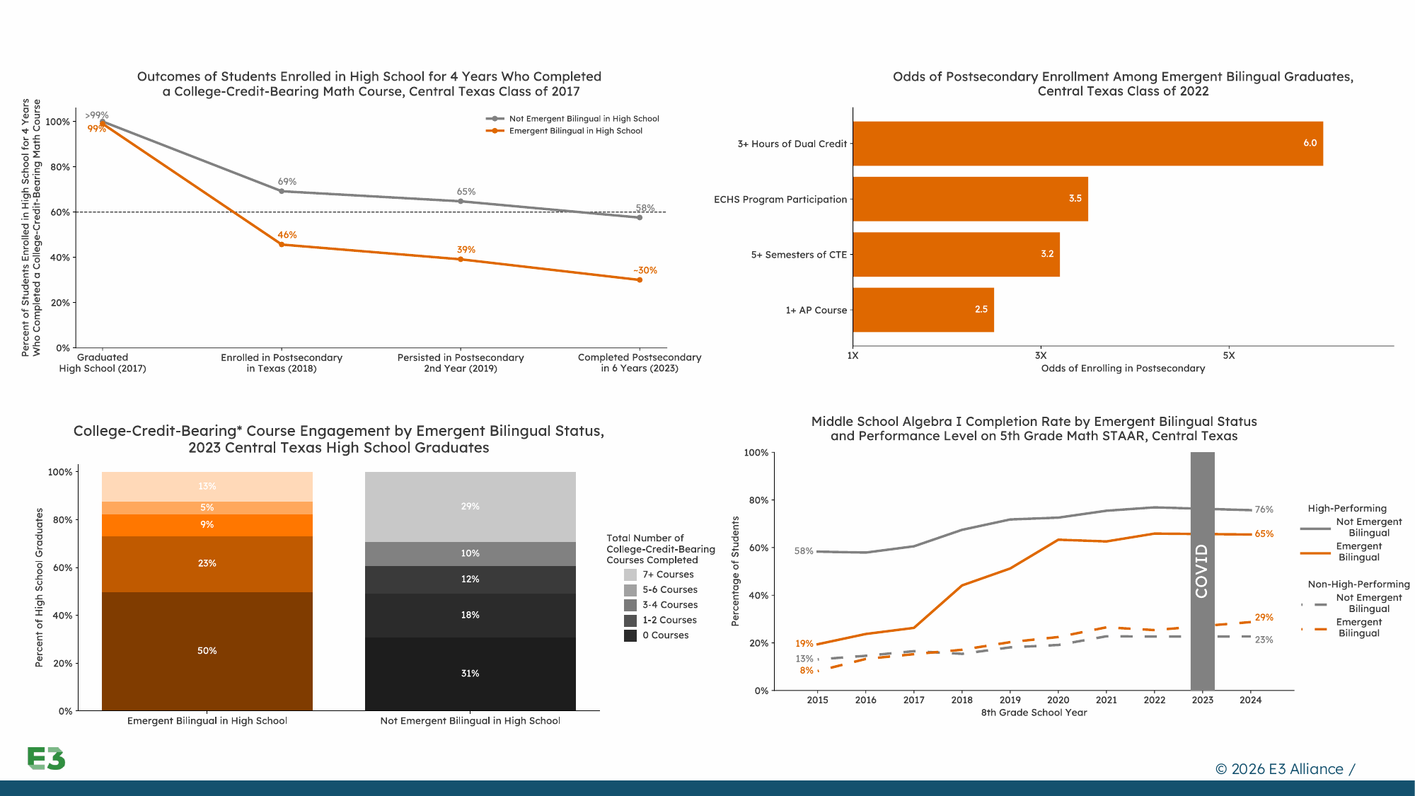
Finding the communication barriers
The main challenge was communication, not visual design.
Keep the research. Clarify the reading path.
The graphs contained accurate, research-backed data and meaningful comparisons. Their presentation made those insights harder to find.
Dense labels and clutter slowed scanning.
Competing visual elements weakened the focal point.
Unclear hierarchy made interpretation harder under time constraints.
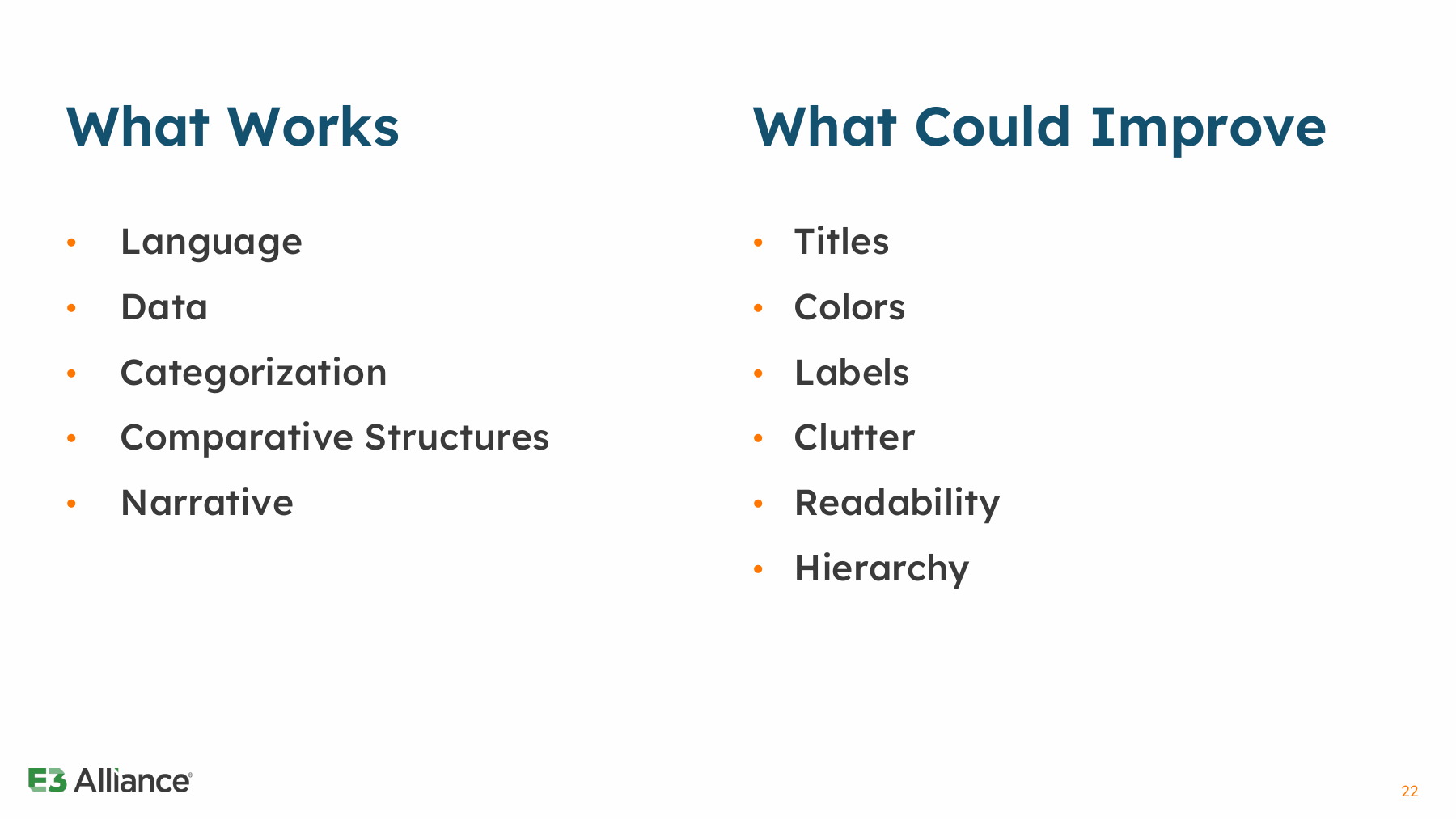
What I changed
I reviewed the graph set, collected visualization references, and annotated printed graphs by hand.
The comparisons and narratives stayed. I identified titles, colors, labels, and hierarchy as opportunities to give readers a clearer entry point.
The design question: how can we preserve complexity while making the information easier and faster to understand?
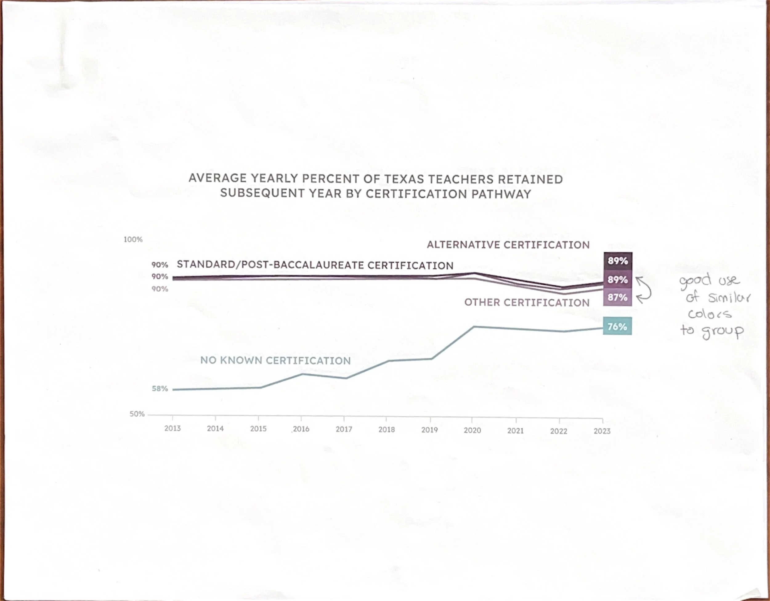
Annotated graph printout: I marked label, hierarchy, and emphasis problems before exploring redesigns.
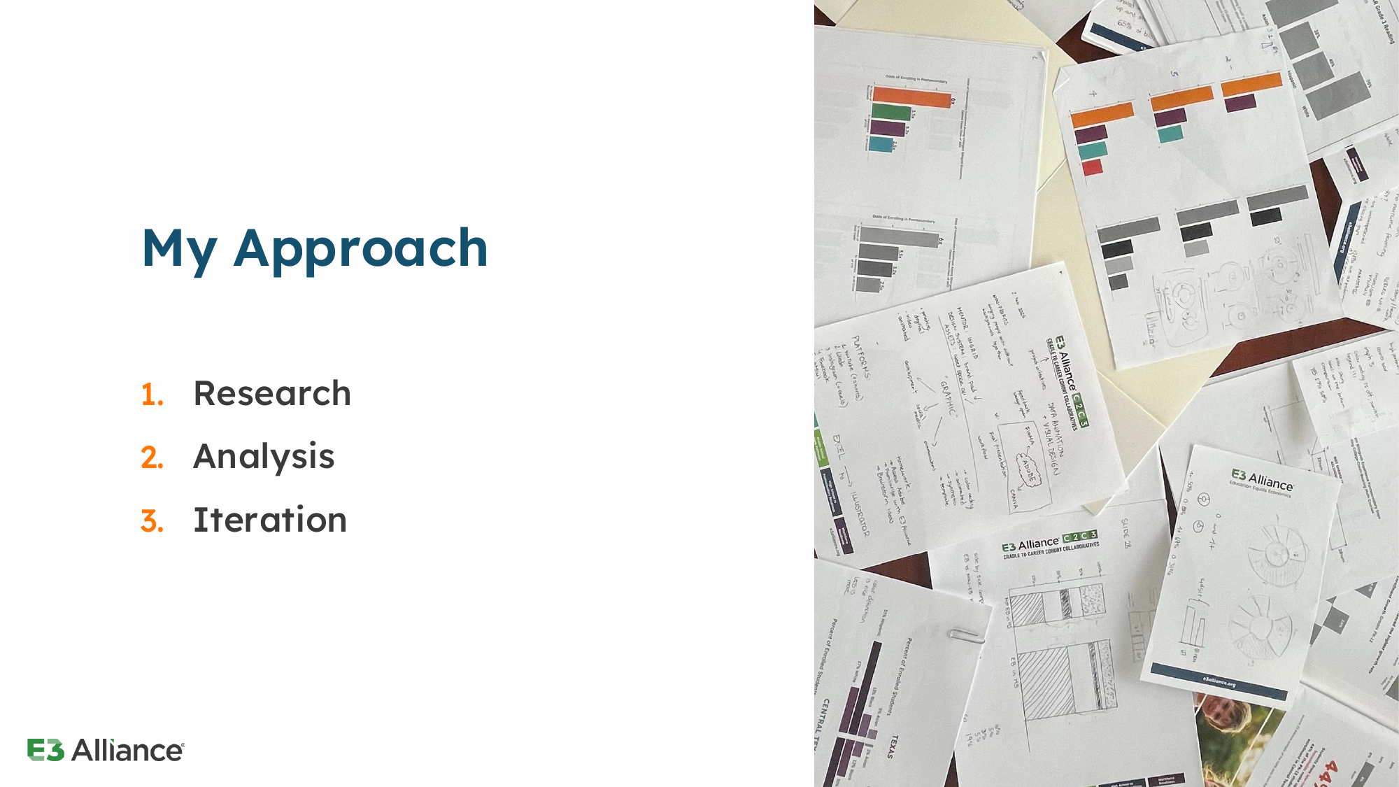
My Role & Approach
As the Data Animation & Visual Design Fellow, I:
Analyzed the existing graphs and explored redesigns.
Animated the information in After Effects.
Documented visual guidelines for future use.
I designed in Illustrator and presented the work in PowerPoint.
E3 supplied the research and existing brand. I focused on how the information was organized and communicated visually.
Visual System
Make the decisions reusable
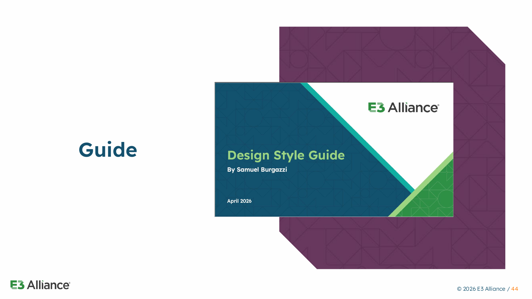
I extended E3’s existing brand into a consistent graph system.
Typography: Lexend and clear title-to-label hierarchy.
Color roles: orange and purple distinguish Graph 1’s student groups.
Direct labels: identify each group beside the data.
Grayscale comparisons: show how the palette translates without color.
The guide records these rules for future graphs. E3 supplied the palette and identity; I applied them to the research visuals.
Open the guide cover to explore the full presentation.
Iteration
1. Name the groups
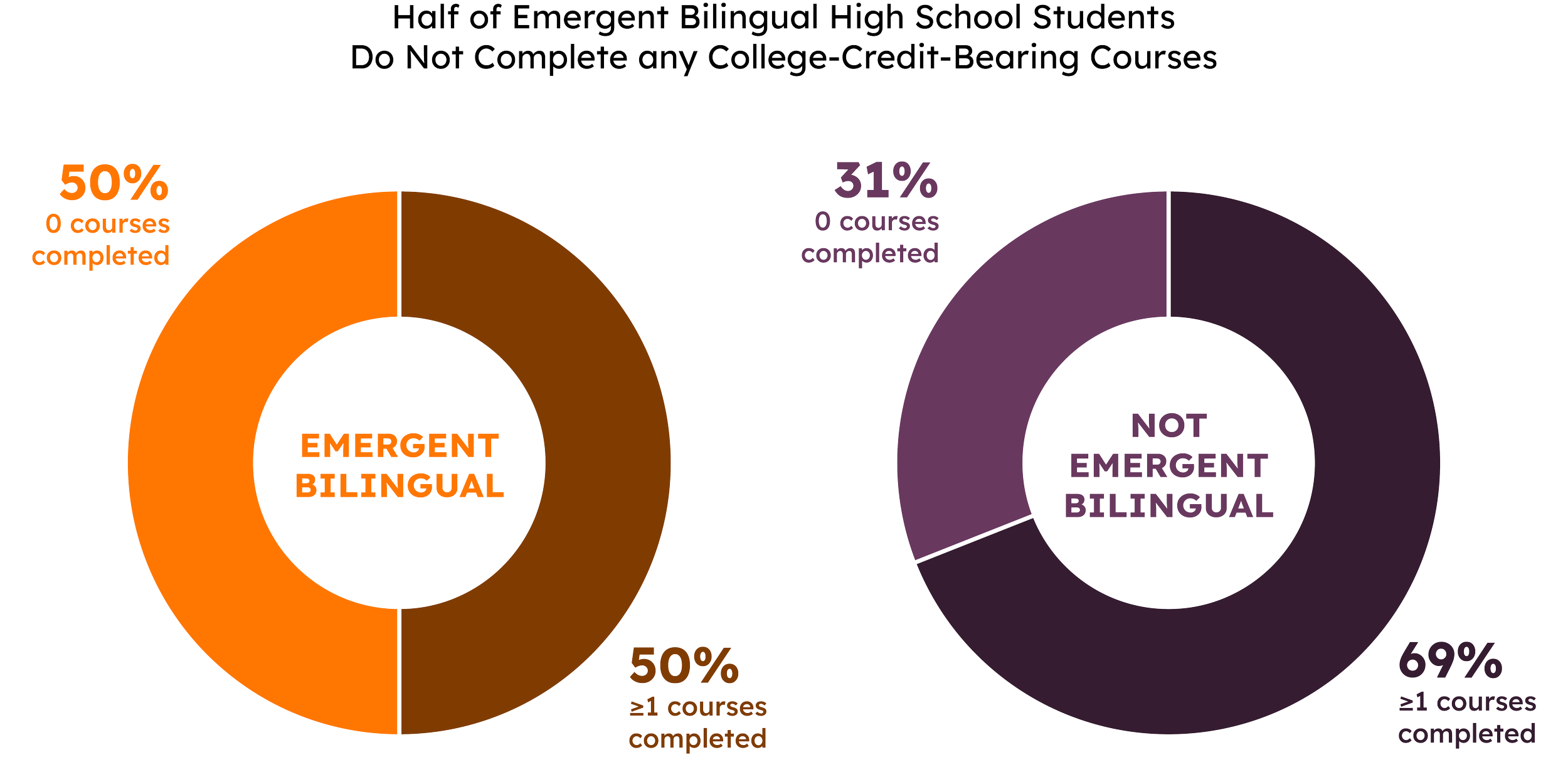
Labels above the donuts make the two populations explicit. The legend still asks readers to look elsewhere to decode segments.
2. Focus the comparison
A shared label and arrows emphasize students with no college-credit-bearing courses. Group names remain below the charts.
3. Lead with the takeaway
A finding-led title explains the main comparison first; shorter legend labels reduce the text to decode.
Review with Communications + RADS: label placement, color, hierarchy, and timing stayed aligned with the research.
Final Designs
The same hierarchy, in two formats
I created static and animated versions of all four graphs. Static exports show the full comparison at once; animation lets the information unfold during a presentation.
Graph 1 carries the decisions from the earlier comparison into the final work: a finding-led title, direct group labels, and explicit percentage-point gaps. In motion, timing controls when readers encounter those elements.
The Graph 1 animation follows in Outcome. The interactive presentation at the end lets you explore the original graphs, redesigns, guidelines, and examples of use.
Outcome
What I delivered
4 redesigned graphs with direct labels and clearer visual priorities.
Static + animated exports for different presentation needs.
A supporting style guide documenting typography and color decisions.
What remains to evaluate
The deliverables demonstrate the design changes. Audience testing would establish whether they improve comprehension and accessibility.
Reflection
Same comparison, different pace
Static: the complete comparison stays visible; readers set their own pace.
Animated: groups appear in stages during a presentation; viewers wait for the full picture.
Timing is a design decision. Titles, direct labels, and emphasis must still carry the meaning when motion stops.
What I would test next
Compare the original and redesigned graphs with the intended audience:
Can readers identify the main finding?
Can they explain the group differences?
Does the animation support that understanding?